Nov 15,2018 Shopify API Ecommerce
Get Inspired: 12 of the Best Shopify Sites
Selling online has never been more competitive. With stand-out designs, innovative features and clever content, sites are getting better and smarter every day. So, how do you be the best of the best? How can you stand out from the ecommerce crowd?
It’s simple – you have to be extraordinary.
No one’s expecting you to go out and learn how to build and design exciting websites. That’s what Juno is for. But it’s good to be aware of all the incredible sites out there, to keep an eye on the competition and gather inspiration for your own site.
Why Shopify?
Building an incredible site starts with an incredible platform, which is why Shopify is the focus of our best-of-breed roundup. Because Shopify handles things like security patches and updates for you, it gives front-end developers more time to dive inside your site and get creative.
From cupcakes and cashmere to cider and tea, here are some of our favourite Shopify sites from around the web.
The simple & effective
Tilly & Reuben
Winning feature: Clean design & simple UX
Tilly & Reuben is a great example of how an out-of-the-box Shopify theme and a few simple design tweaks can create a hugely successful website. This family-run site started as a way for busy parents Laura and Lee to spend more time with their kids, but it quickly grew into a popular baby clothing brand.
One of the things that makes this site a winner is that it’s perfect for their target audience: busy parents looking for affordable, quality clothes for their kids. The site doesn’t showcase any inventive designs or features, and it doesn’t need to. The simple UX, the warm, minimalist branding and the easy shopping journey have made this site a hit with mums everywhere.
Bombas
Winning feature: Product highlights pulled out in beautifully simple ways
Bombas is a luxury sock brand, powered by Shopify Plus. Their site immediately stands out for its carefully considered design, which showcases the same quality and aesthetic as the socks themselves. Innovative features like the live sock-donation counter highlight the brand’s unique selling points, and an unobtrusive live-chat button helps sway any hesitant customers.
Every product page includes a detailed breakdown of the product, with gorgeous imagery and short, snappy copy. Because this breakdown comes below the fold and is beautifully laid out, it doesn’t interfere with the buying process.
Bombas is a site that demonstrates how minimalist design and bespoke features can create a stunningly simple site. And with millions of dollars’ worth of socks sold every single year, they must be doing something right.
The beautifully on-brand
Denver & Liely
Winning feature: Incredible content that enriches the brand
Despite being a small brand, the Denver & Liely website is one to behold. Started by two drinking buddies in Australia, Denver & Liely sell quality gin, whisky and bourbon glasses, with a site that emphasises their ‘simple, good design’.
The homepage showcases a split-screen layout, with clear calls-to-action on one side and warm, inviting product imagery on the other. As you scroll, more incredible product imagery slides into view from opposing ends of the screen, creating a smooth, eye-catching transition that helps reinvent the everyday act of scrolling.
What’s so impressive about the Denver & Liely site is that they create a whole world out of a small brand and a tiny product range. One of the highlights is their ‘Quench’ journal, a thoughtfully laid out blog that’s packed with exciting, relevant content. With a host of videos, photo journals, reviews and recipes, it’s a great example of how content can enrich a brand.
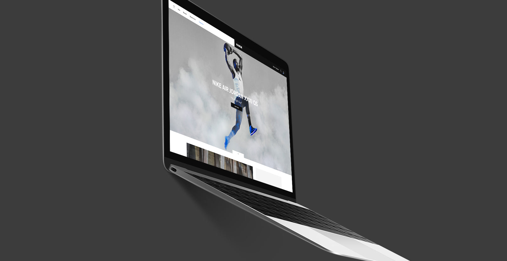
Hanon
Winning feature: Minimalist design and great UX
Sometimes, less is more – and that’s exactly what Hanon’s Shopify Plus site champions. Hanon is a skateboard-inspired streetwear and footwear brand, selling limited-edition trainers to sneakerheads all over the world. With a minimalist design and a slight urban edge, their website is as effortlessly cool as the brand itself.
Hanon’s homepage immediately showcases their ultra-cool product imagery, with a mouse-over zoom-in effect to give depth to the site. The front page takes the unusual step of including a huge list of shoppable products, with three categories to choose from. For a brand that celebrates fast-fashion and changing trends, these homepage categories launch customers straight into the shopping experience, enabling them to browse the latest trainers as soon as they land on the site.
The Hanon site also includes an Instashop section, which features a gallery of the brand’s Instagram pictures with shoppable links to the products. While most fashion brands now have a shoppable Instagram feed, many forget to go the extra step and include this gallery on their site. For brands like Hanon, the Instashop is an easy way to direct customers to the most-coveted sneakers of the season.
The fast & fun
Tick Tock Tea
Winning feature: Vivid, eye-catching design & quirky flourishes
When browsing the internet becomes part of your everyday routine, sometimes you need to look at something fun – like Tick Tock Tea. One of Britain’s favourite independent tea brands, Tick Tock Tea pride themselves on ‘brightening up kitchen cupboards everywhere’. So it stands to reason that their site should be as bright and cheerful as the packaging itself. With bold, coordinating colours, a time-sensitive homepage banner and a live ticking clock, Tick Tock Tea is something truly special.
Tick Tock Tea is another brand with fantastic content. Going a step further than traditional branded blogs, they have ‘The Tock Times’, an on-site section for seasonal articles, news and competitions. The site also has heaps of content about the brand’s history, their different teas and how tea can affect well-being, giving the brand depth and creating a site that’s simply a joy to visit.
Austin East Ciders
Winning feature: Incredible product pages
When all you sell is one type of product – cider – you’ve got to pull out all the stops to show that product off. And that’s exactly what Austin Eastciders do. Positioning themselves as cider experts, the Austin Eastciders website is packed with researched content, mouth-watering imagery and behind-the-scenes production videos to add weight to their brand.
Think product pages are simply where you ‘add to cart’? Think again. These pages are where Austin Eastciders really start to shine. Each flavour of cider has a dedicated product page, with background and font colours that coordinate with the colours on the can. The image of the cider can be flipped over, creating an interactive experience that allows customers to see the nutritional information for each drink. Every page also includes a selection of drinks recipes for that flavour cider, creating a well-rounded product that inspires as well as tempts.
The fashion-forward
Chinti & Parker
Winning feature: Minimalism meets colour in a true celebration of cashmere
Chinti & Parker aren’t your average high-fashion, cashmere brand. What started as a way to reinvent the cashmere market has now garnered a customer base of celebs, including fashion-icon Alexa Chung. Designing luxury womenswear ‘with a twist’, the brand combines a playful approach with timeless techniques, and their Shopify Plus site celebrates everything that makes them different.
At first glance, the site sports a minimalist, classic design, with an easy-to-navigate left-hand navigation menu and an image-led homepage. But look closer, and Chinti & Parker’s playful personality starts to shine through. Towards the bottom of the homepage, doodle-like hits of colour elevate the otherwise minimal design. An animated looping line draws attention to the brand’s email sign-up box, with large, colourful text above reading ‘HELLO HELLO’. Underneath, more bright illustrations help underpin their branding, which injects colour and humour into the cashmere market.
Deeper into the site, Chinti & Parker use content like care guides, lookbooks and seasonal blog posts to enrich their brand. Now, the brand are starting to use the Shopify Plus platform to open pop-up stores in London, where fans can come and immerse themselves in the world of Chinti & Parker.
Ally Capellino
Winning feature: Ultra-minimalist design that showcases incredible product imagery
Ally Capellino are part high-fashion brand, part contemporary artists. With designs that have been featured in the V&A Museum, Ally Capellino bags are quite literally a work of art.
When a product is as beautiful and exquisitely crafted as these bags, it’s essential that the site doesn’t distract attention away from the product. That’s why, with an ultra-minimalist design and stunning imagery, the Ally Capellino site is 100% about the product. Powered by Shopify Pus, the site looks almost as good as the bags themselves.
Taking a closer look at the site, you can see that a sticky, transparent top navigation menu means customers can scroll through the homepage without a solid header blocking any of the imagery. Instagram pictures are neatly laid out like an art gallery display at the bottom of the page, and further into the site, the brand’s lookbook is presented like a magazine, with arrows to navigate through the brand’s most recent looks.
The highest-grossing
Kylie Cosmetics
Winning feature: Influencer power meets stand-out design
When reality-star-turned-A-list-celeb Kylie Jenner first launched her own lipstick brand, she had no idea if she’d be able to make a dent in the beauty industry. Two years and 800 million dollars later, she’s on track to be the youngest self-made billionaire in history.
One of the keys to Kylie’s huge ROI is her clever use of resources, choosing not to splash cash on things like physical retail space. Instead, she lets her site do the talking. Powered by Shopify Plus, her website showcases a minimalist, sexy design that harnesses Kylie’s power as a mega-influencer, showing her face at every opportunity. Design flourishes like a dripping lip-gloss font and sensual swatches keep your eyes glued to the screen, and pages like ‘Kylie’s Favourites’ let her fans shop the products she loves right now.
Although Kylie scrimped with the retail space, she used the Shopify platform to launch several pop-up stores, attracting over 35,000 people. Many of these pop-up shoppers became loyal customers, helping transform the Kylie Cosmetics start-up into the multi-million dollar business it is today.
Gymshark
Winning feature: A simple design for a simple idea
Another site that’s cashed in on the influencer trend is Gymshark. Now the UK’s fastest-growing company, Gymshark’s founder Ben Francis originally started the brand by selling print-screened activewear out of his parent’s garage. Using popular fitness figures from YouTube and Instagram, Ben got the word out about his new, more-fitted style of gym clothing. When demand began to grow, he invested in new tech and a brand new site to keep growing the Gymshark business.
After a disastrous venture into Magento, which saw Gymshark’s site go down for eight critical hours on Black Friday, the brand re-platformed to Shopify Plus. Like most quality fashion websites, the Gymshark site is photography-led, with neutral colours and a clean top navigation menu. A shoppable Instagram footer on every page helps reinforce their theme of selling through the power of social media.
There’s nothing glitzy or glam about the Gymshark site; their focus remains on selling quality products, without the distraction of flashy designs. And it pays off – the brand made a staggering $128 million in the fiscal year 2018.
The crème de la crème
Batch Organics
Winning feature: Animated features & a kick-ass shopping journey
Batch Organics is a brand that capitalises on the healthy, Instagram-worthy food trend, delivering cups of smoothie ingredients to their young, busy customer base. The ingredients are pre-measured and flash-frozen, meaning customers simply need to add liquid and toss them in a blender.
With a target audience of Instagram-savvy professionals and time-pressed millennials, it’s no surprise the Batch Organics website looks spectacular. Showcasing a bright, trendy colour scheme and tantalising product imagery, the homepage immediately gets your mouth watering. Further down the page, an animated set of instructions work to both delight the customer and demonstrate the simplicity of the product.
One of the best things about the Batch Organics site is that their creativity doesn’t detract from the buying process. Clear CTA buttons on the top navigational menu and the rotational banner help direct customers exactly where they need to go, and an interactive category page lets them create and customise their smoothie box in a few simple clicks.
Crumbs & Doilies
Winning feature: Deliciously animated flourishes & a stunning design
Okay, we may be biased (seeing as we designed it) but Crumbs & Doilies truly is one of our favourite Shopify Plus sites. From animated features to a delicious design, the site celebrates the brand’s tasty treats in a spectacular fashion.
Crumbs & Doilies’ colourful cakes are incredibly good-looking, so it makes sense that their site is equally as attractive. The homepage immediately immerses you in a gorgeous pastel colour theme, with tempting product imagery and a clear call-to-action. Layered imagery and a zig-zagged product carousel keep the layout unique, and an embedded video section lets customers see the latest videos from the brand’s founder, Cupcake Jemma.
As beautiful as the theme is, the true star of the show on the Crumbs & Doilies site is the animation. Instead of an ordinary shopping basket, they have a cupcake that spins when you move your mouse over it. At the footer, a quirky ‘This Way Up’ arrow directs customers back to the main part of the page. As the icing on the cake (pun intended), an animated pull-out menu shows a moving background of tiny stars, hearts and other cute shapes.
The Crumbs & Doilies site is a true testament to the wonderful things you can achieve with Shopify Plus.
Feeling inspired?
Whipping up good-looking sites that dazzle customers is our day job. From bespoke themes to animated features, we build websites that encompass and celebrate your brand. And with ongoing design, marketing, SEO and growth support, we’ll keep taking care of your site, even after your launch.
Got a project you’d like to discuss? Get in touch here.