Oct 11,2012 Shopify API
eBay steps up its game

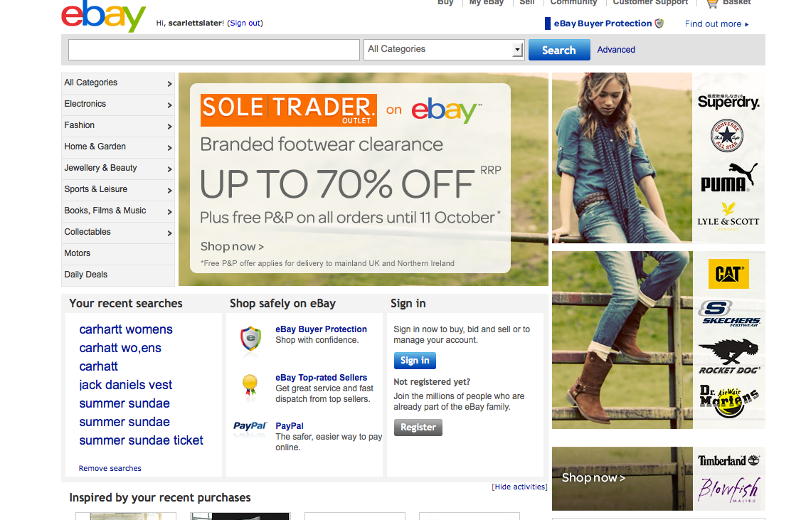
Here at Juno we like to keep up with the latest developments in the web design industry, and when a well-known brand has a makeover we take notice. eBay is the latest company to go for a revamp—it’s gone for a more modern, minimalist approach to refresh interest in its service and step up its game in the booming online retail sector, and a new site design seems to be at the cornerstone of its new strategy.
We’ve been talking a lot recently about the need for clean, simple and intuitive design, and it seems eBay has taken that on board. Gone are the boring vertical lists and overly cluttered interface—in its place we get a pin board-style homepage (think Pinterest for the retail sector), clean profile pages and simple navigation, with the emphasis being much more on product images to deliver an eye-catching, contemporary result. The logo’s been given a makeover as well for a cleaner, more modern feel, and shoppers can look forward to a more convenient way to browse with added personalisation potential.
Everything has been designed to modernise the brand and make it a key player in the industry, setting it up as a true competitor to Amazon and re-igniting customer interest in what it’s got to offer. There’s a clear focus on making the whole thing more personal, with the brand giving visitors the opportunity to customise their experience for a more intuitive, inspiring way to shop, and there’s even plans to offer a same-day shipping service (as yet only available in the US—watch this space).
It just goes to show what effective web design can do. The new format is much simpler and more visually appealing, utilising white space and images to great effect, with the whole thing being a lot easier on the eye. It’s this kind of design that’s vital if brands want to move forward in the online arena, so if you think it’s time for an upgrade make sure to take a leaf out of eBay’s book and go modern, minimal and clean to really step up your game.


