Nov 27,2012 Shopify API Ecommerce
Windows 8 criticised for its poor design

Poor Microsoft. After much fanfare surrounding its latest operating system, the unveiling of Windows 8 seems to have fallen pretty flat. In fact, industry insiders are criticising it for its poor design features and generally confusing navigation, and it seems there are several points of contention.
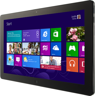
Let’s start by looking at the option for users to choose between a tablet-based start menu and a more traditional desktop one. Yes, it might offer a level of choice that other operating systems don’t, but it actually results in an inconsistent experience for the end user with the two environments actually working very differently.
Then there’s its Live Tiles feature, which displays the most recent information within an app to alter the appearance to theoretically attract users with new photos and content, but in reality it may not work quite so well. The ever-changing appearance could distract users and make them difficult to identify with individual apps, and although it works well for some of them it doesn’t for many others.
The Charms feature is another issue. The feature involves a panel of icons which can slide in from the side of the screen to allow users to search for or share content, but because the Charms are hidden a lot of new users don’t use them and they also don’t work universally either, resulting in a poor user experience and a lot of disappointments.
A lot of industry insiders have branded the whole thing confusing, but we can all learn from Windows 8’s downfalls. Perhaps the biggest lesson we can take from it is that innovation for innovation’s sake isn’t necessarily a good thing, with the whole point of a decent design being to attract rather than distract, to engage rather than enrage (ahem) and to ultimately offer a great user experience.
Simplicity is key and whilst it’s all well and good showcasing a few high-end features you don’t want to take things too far, so learn from Microsoft’s mistakes and offer something that your readers can’t say no to.


